One of the joys of planning a wedding is choosing a color palette to reflect your personal style. This guide can help you plan the look and feel of your wedding, starting with the first spark of creativity and taking you all the way through to the end of the reception.
Consider the Mood
Color impacts the atmosphere and sets the tone of an event, so your wedding color scheme essentially dictates how you and your guests will experience the big day. Get the wedding party together and discuss what personality you’d like to bring to the ceremony and reception.
Think about what best reflects your relationship with your significant other. Is your love fiery and passionate, quiet and caring or simple and joyful? Which colors remind you of important milestones in your relationship, such as your first date or the day you got engaged? You may have difficulty conveying these emotions and memories with words, but color can break the language barrier to show your feelings in a stronger, more direct way.
Single colors and color groups are associated with different emotions and reactions. Blues, greens and other cool tones convey serenity and calm. Warmer shades, such as yellow and red, are more charged and upbeat.
The intensity of a hue also has an effect on the response it generates. Your wedding will feel more elegant if you go with rich, deep tones than if you choose pastels. Bright shades lighten up the mood, and a neutral palette tells guests you’re putting together a classic wedding.
Seasonality is also an important consideration. As much as you may like the idea of bright and sunny shades for your winter wedding, it may not be possible to get flowers in appropriate colors or find decorations designed to sing the praises of spring and summer. The same is true for cool color schemes in warm seasons.
The time of year during which you’re having the wedding also contributes a mood of its own, so think about how to incorporate this unique feeling into your color planning. Embracing the exuberance of summer or a festive spirit in winter could give you a whole new perspective on which colors to use.
Finding Inspiration
There are many places to look for inspiration as you brainstorm wedding colors. One of the most diverse and extensive sources is Pinterest, where you can search through posts for individual elements, such as centerpieces and cakes, or browse boards put together by other users. Follow your favorite boards and gather the designs you like best together into your own collections. You can also create a communal board to which your fiancé and members of the wedding party can contribute, pinning any ideas they come across and want to share.
Wedding-specific sites provide more tools and resources to inspire and guide your color planning:
- The Knot organizes wedding colors by season and specific color schemes. Click on a seasonal category to see pictures and ideas from real weddings, sorting posts by color, theme or setting to find which styles speak to you. Browse their “Wedding Color Advice” section for more help choosing a palette.
- Wedding Paper Divas also presents ideas seasonally and generates color schemes based on your favorite shades. Each theme is organized on its own Pinterest board with ideas for dresses, decorations, food and more.
- Bridal Guide and The Perfect Palette both give you a full table of color swatches from which to choose. Click on any circle to bring up beautiful wedding photo collections.
Although these online sources provide nearly endless ideas, unplugging for a while can be just as fruitful. Take a break from browsing to spend some time out in nature and get back in touch with colors you see every day but may not appreciate. Pay attention to flowers, the colors of leaves, berries growing on bushes and even the feathers of birds. Snap pictures to add to your color plan when you return from your walk.
If you don’t have access to a natural environment, you can still be inspired by the hues found in everyday life. People have their own unique styles, and you may be surprised by the amazing color combinations you discover when making a deliberate effort to notice the details of your surroundings. Even a parked car could spark something in your imagination.
Pictures from past vacations or photos of places you’ve always wanted to visit are other great sources of inspiration. Use colors from these images to recapture special memories or transport yourself to a faraway destination on the day of your wedding. For a truly special experience, try incorporating prominent colors from your honeymoon destination.
Starting with a Base Element
As you search for colors around which to
design your wedding, you may come across items you find particularly interesting:
- Patterned fabrics
- Cakes
- Buffet layouts
- Centerpieces
- Wedding or bridesmaid dresses
- Flower arrangements
- Invitation designs
Some of these offer complete wedding color schemes you can use as-is. Others hint at full palettes, providing just enough of an idea of where to take the theme to make them viable as the basis for the design of your whole wedding.
However, ideas for colors don’t have to come from items directly relating to the ceremony or reception. Anything fitting your desired mood is fair game as a starting point. Approaching your color choices this way opens up a new world of possibilities. It may seem strange to show your wedding planner the sweater your significant other was wearing the day you got engaged or to walk into a flower shop with a leaf you picked up off the street, but if it’s the color you like best, don’t hesitate to go with it.
Get Trendy
Annual and seasonal wedding color trends can give you a starting point for your own colors or provide entire palettes for you to emulate. Search for current trends to discover what’s hot, and see if any of the combinations speak to the mood of your wedding. Let themes like these guide your planning:
- Aqua and coral
- Orange and cobalt blue
- Yellow and white
- Cranberry red with ivory white and orange
- Peach with green and gold
- White and green with natural brown
- Light yellow with gray, violet and light blue
Don’t be afraid to seek out interesting and unusual colors for your ceremony. Seemingly unmatched or “taboo” shades can be beautiful when put together or tempered by a neutral backdrop. Browsing photos of uncommon palettes can introduce you to colors you may never have thought to use, such as pumpkin orange and slate gray or eggplant purple with navy blue. If you’re a lover of classic shades, stick with recognizable choices such as red, white, teal, coral, purple, blue and the popular combination of black and white. These wedding themes have remained largely unchanged by the test of time.
Trends aren’t for everyone, so don’t feel obligated to go with the flow to plan your wedding. When a color combination stands out to you enough to be worth mimicking, make it your own with personal touches and unexpected elements to wow your guests.
Finalize Your Colors
Once you’ve chosen your mood, searched for inspiration and found a few basic elements or trends you love, the next step is to start pulling everything together into a cohesive wedding color scheme. The easiest way to do this is to get a color wheel at a craft store or use an online color wheel to round out your palette. Although many of these online tools are geared toward web developers creating websites and blog templates, they can be used for any kind of color planning.
To use a color wheel, you need to understand how colors work together:
- Analogous colors are next to each other on the color wheel and share a similar hue and intensity. Using this type of color combination results in a wedding with a pleasing visual cohesion as colors seem to blend softly while remaining distinct.
- Complementary colors are located across from each other, such as blue and orange, purple and yellow or red and green. A complementary scheme draws the eye by making different elements stand out strongly from each other.
- Split complementary colors give you an easy way to incorporate a third color into your wedding without the risk of your chosen shades clashing. Instead of using a directly complementary color, the colors on either side are used to create balance.
- Triadic colors are evenly spaced on the color wheel to create maximum contrast. How well this works in your wedding depends on the color you use as a starting point. When done right, a triadic theme can also result in an attractive balance.
You have a few choices when using a color wheel. You can start with one color and let the tool guide you based on the type of color balance you want, or you can choose specific colors and use the wheel to tweak the shades until visual equilibrium is achieved. Go deep, bright, soft or sunny, trying all the ranges of color until you find the right combination to fit the mood of your ceremony.
If you feel overwhelmed trying to pick your own colors, go back to the wedding sites you used for inspiration. Some will generate entire color collections with just a few clicks so that you don’t have to spend a lot of time comparing colors and trying to decide on the shades and intensities you want to use.
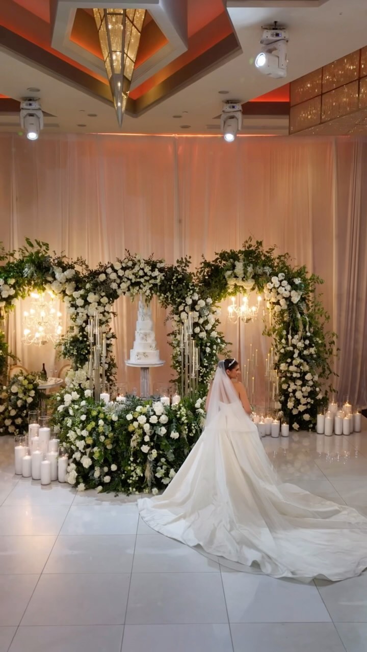
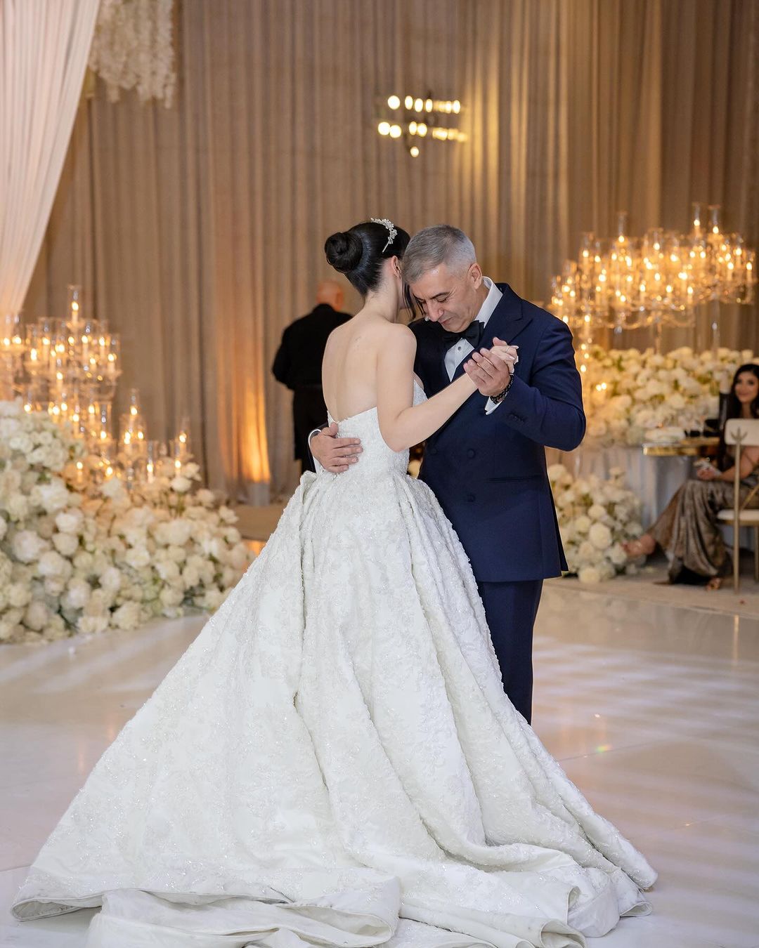
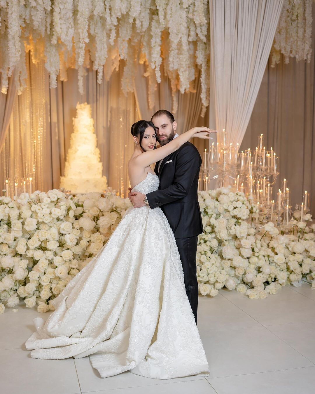
Another simple option is to stick with a monochromatic scheme. This involves using multiple shades of a single color to create a unique visual effect. When paired with neutral background colors and minimal décor, a monochromatic color palette can result in a beautiful and elegant wedding setup.
Use Your Colors Everywhere
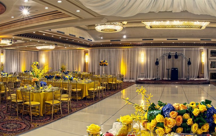
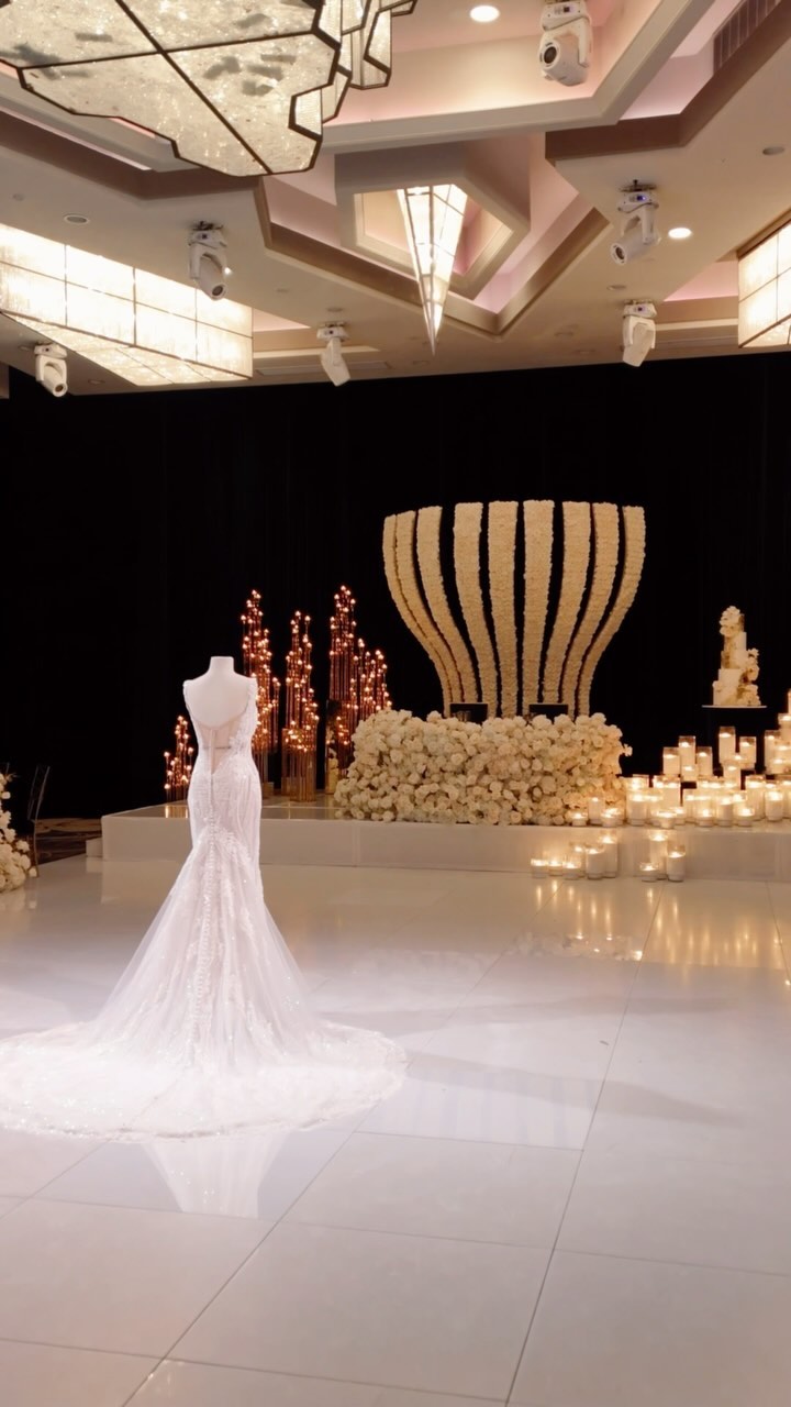
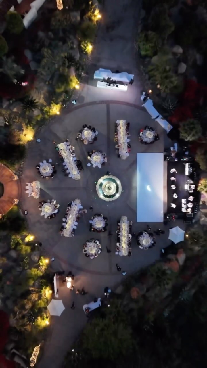
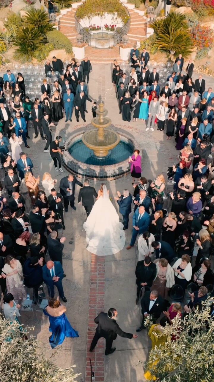
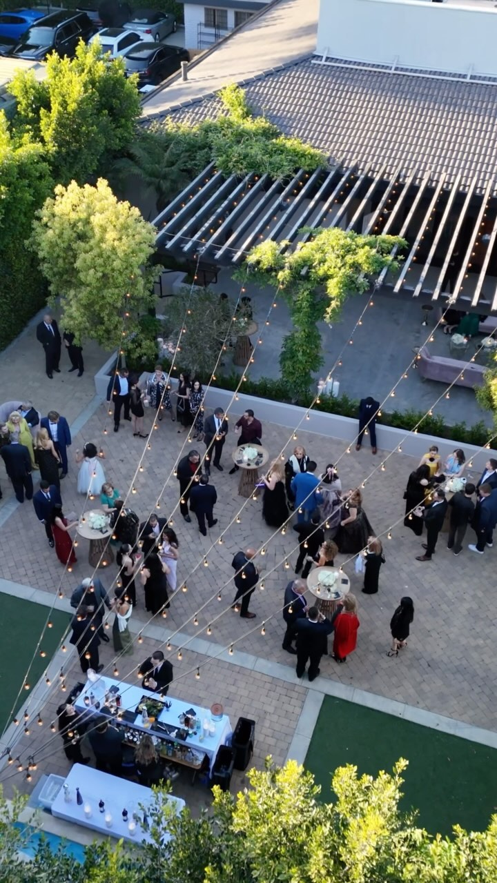
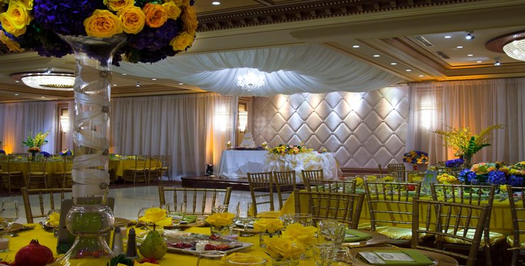
When you’re satisfied with your color scheme, put it into action. Incorporate your colors into every part of the ceremony and reception. Introduce guests to your color scheme with coordinating invitations so that they have a preview of what kind of atmosphere to expect. Match the furniture, dresses, suits, bouquets and boutonnieres to your color scheme, and everyone will get right into the mood of the ceremony the moment they arrive.
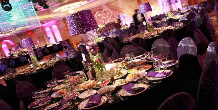
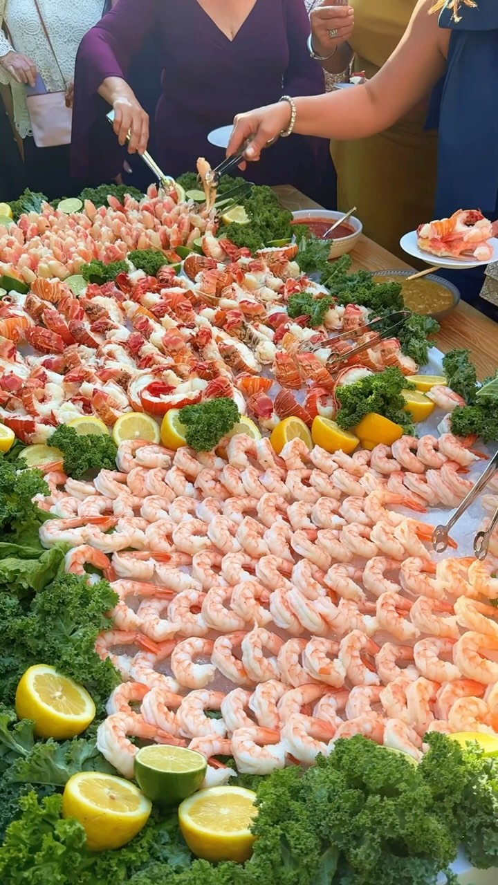
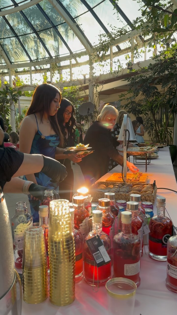
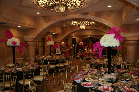
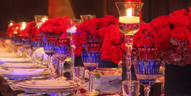
Make the reception an extension of the ceremony with colorful table settings, place cards, centerpieces and even food and beverages. Caterers can create dishes and treats in all of your wedding colors so that the buffet table itself is part of your color scheme. Custom labels on beverage bottles and colorful straws for drinks provide more opportunities to showcase the shades you love. Add unique, attractive accents to round out the décor, such as hanging ribbons, colored utensils or big balloons.
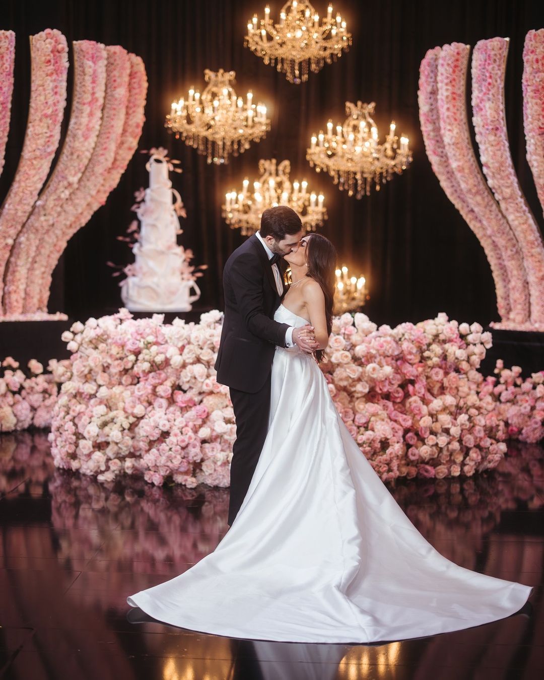
The cake is another place to be creative. Whether you
hire a professional, have a talented friend or are proficient in baking and decorating your own confections, a cake provides a blank slate on which you can “paint” your wedding colors. Thanks to modern technology, it’s even possible to have custom decorations made using a 3-D printer.
As you set everything up, don’t worry too much if there are a few slightly “off” elements. The cookies in the dessert bar don’t have to match your shoes, and the flower arrangements will still look beautiful if they’re not the exact same shade as the organza bags in which you’re giving away as wedding favors. The point of playing with your color palette is to have fun creating a beautiful wedding, not to be hung up on perfection.
Taking Advantage of Technology
In addition to static elements, there are many high-tech ways in which you can incorporate color into your wedding. Today’s venues have equipment for projecting photos, playing videos and creating
special lighting displays to match your wedding colors or specific theme. If you can dream it, they can do it!
Wedding apps like Appy Couple, LadyMarry and Joy provide more tools for incorporating multimedia into the ceremony and reception. Using these platforms, guests can snap photos or shoot videos and share them instantly on social media, bringing a dynamic element to your big day.
The sky is pretty much the limit when you use these technological advances to enhance your wedding. Talk with your chosen venue to find out what’s available, and consider adding a few unique elements to make your special day truly distinctive.
Picture Perfect
What wedding is complete without photos of the happy couple’s journey toward becoming man and wife? Collages and other static picture boards with color-coordinated frames can be easily incorporated into your wedding’s palette, but technology offers a more dynamic way to show guests how the story of your love unfolded. Go through your photos to find those with the appropriate mood and most relevant colors, and create a photo reel to put on display during the reception.
For a more spontaneous photo collection, look for lighting or production professionals offering services designed to collect the pictures your guests take, including Instagram posts, and project them for all to see. Create a custom wedding hashtag for your guests, and include it when you send out invitations.
Add Some Action
Do you want something more engaging than photos to boost the personality of your reception? Multimedia or video presentations draw attention, especially when paired with music. Digital video can be enhanced with a variety of effects, including color, and used to bring your story to your guests as they enjoy the celebration. Ask friends and family to contribute favorite video clips to round out your collection, and collaborate with a professional to work the presentation into your color scheme.
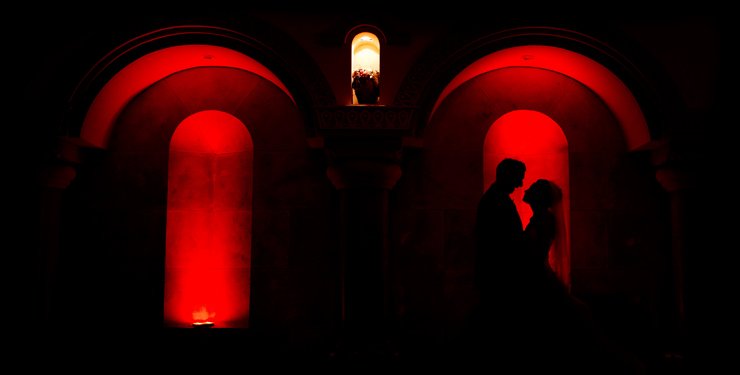
Light it Up
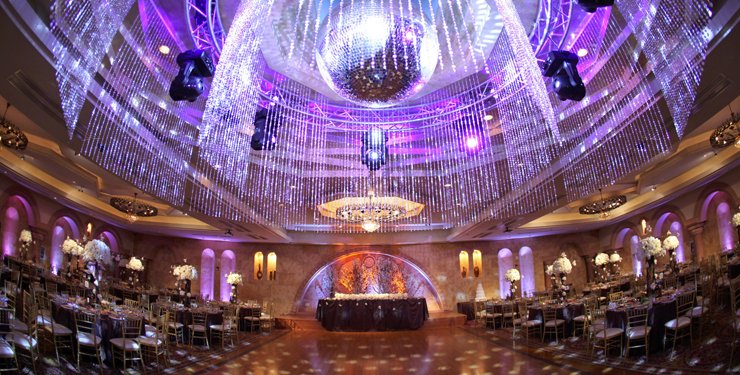
Like wedding colors, lighting has a big impact on the mood of the ceremony and how guests experience the reception. Work with your venue and a lighting specialist to choose the right combination of hanging lights, string lights, spotlights and other distinctive fixtures, and make sure your chosen colors are part of the design plan. If you chose a particularly bold or bright palette, neutral lighting may make the best compliment. Softer colors can be incorporated into the lighting itself to add personality and create a unique atmosphere.
When it comes time to hit the dance floor, the venue or the DJ may be able to coordinate the lights with the music or provide other lighting options to liven up the reception. Use your palette to enhance the experience and provide a special glow in which you and your spouse can linger while enjoying your first dances as newlyweds.
Keeping it All Together
Wedding colors are just one of the many details you need to keep track of when planning your special day. While a wedding binder has long been the gold standard for organization, this method can become tedious and overwhelming as your collection of information grows. The closer you get to the day of the ceremony, the bigger and less practical the binder becomes.
With the right tools, you can skip the binder and still stay on top of your wedding plans. The same apps with fun photo and video features also offer step-by-step planning checklists and places to store all the information you need for planning and pulling off a great wedding. Some allow you to snap photos of flowers, dresses, centerpieces and other items related to your color scheme as you discover them and store the pictures for future reference. This keeps color ideas together with venue information, guest lists, registries and other important information.
If you want a tool just for organizing your colors, head back to Pinterest. Start boards for the various aspects of color planning, including inspiration, brainstorming, décor, clothing and food. You can pin to and access your boards from anywhere with the Pinterest app for iOS and Android, making it easy to collect ideas and share them with your wedding party and the professionals with whom you’re working.
Evernote and Trello are also useful tools for color planning. With Evernote, you can create separate notebooks and populate each with notes relating to your wedding. A note can be an image, a video, a bookmarked website, a PDF file, an article or a blog post, and you can add your own annotations to remind yourself why each one is important. Trello uses a layout of boards and cards with options to add checklists, color-coded labels and attachments like website links and images. Both tools are cloud-based for quick access on the go.
Common Color Mistakes
Nothing ever goes quite as planned when putting together your wedding, but problems with color don’t have to throw off the whole process. To make your wedding beautiful from beginning to end, avoid the mistakes many brides-to-be make when choosing color schemes:
- Limiting décor choices by trying to force every element to fit the color scheme exactly.
- Insisting on following a current trend in every detail.
- Choosing too many colors.
- Going crazy with unusual, unnatural or overly bright shades.
- Creating flower arrangements with the right colors but the wrong textures.
- Picking a color combination unfit for the basic colors of your venue.
- Overwhelming the eye with out-of-balance colors.
- Using cliché colors associated with major holidays, such as red and green or red, white and blue.
- Putting your bridesmaids in unflattering dresses so as not to “disrupt” the color scheme.
If you can’t find an exact color match for certain elements of your wedding, go with a neutral shade instead of driving yourself crazy in a fruitless quest for perfection.
Work closely with the wedding professionals putting your ceremony together to ensure the correct shades of each color are used for flowers, table settings, cake decorations and attire. Simply saying you want green or white could get you widely different results from vendor to vendor. Familiarize yourself with the exact names of your chosen colors so that your design remains cohesive.
When all the colors for your wedding come together, there’s a special moment where the whole day suddenly feels more magical and real. A cohesive palette provides a blueprint for choosing all the other décor elements and makes the planning process easier. Put it all together, add your personal flair and you’ll have a stunning setting in which to make some of the most beautiful memories of your life.